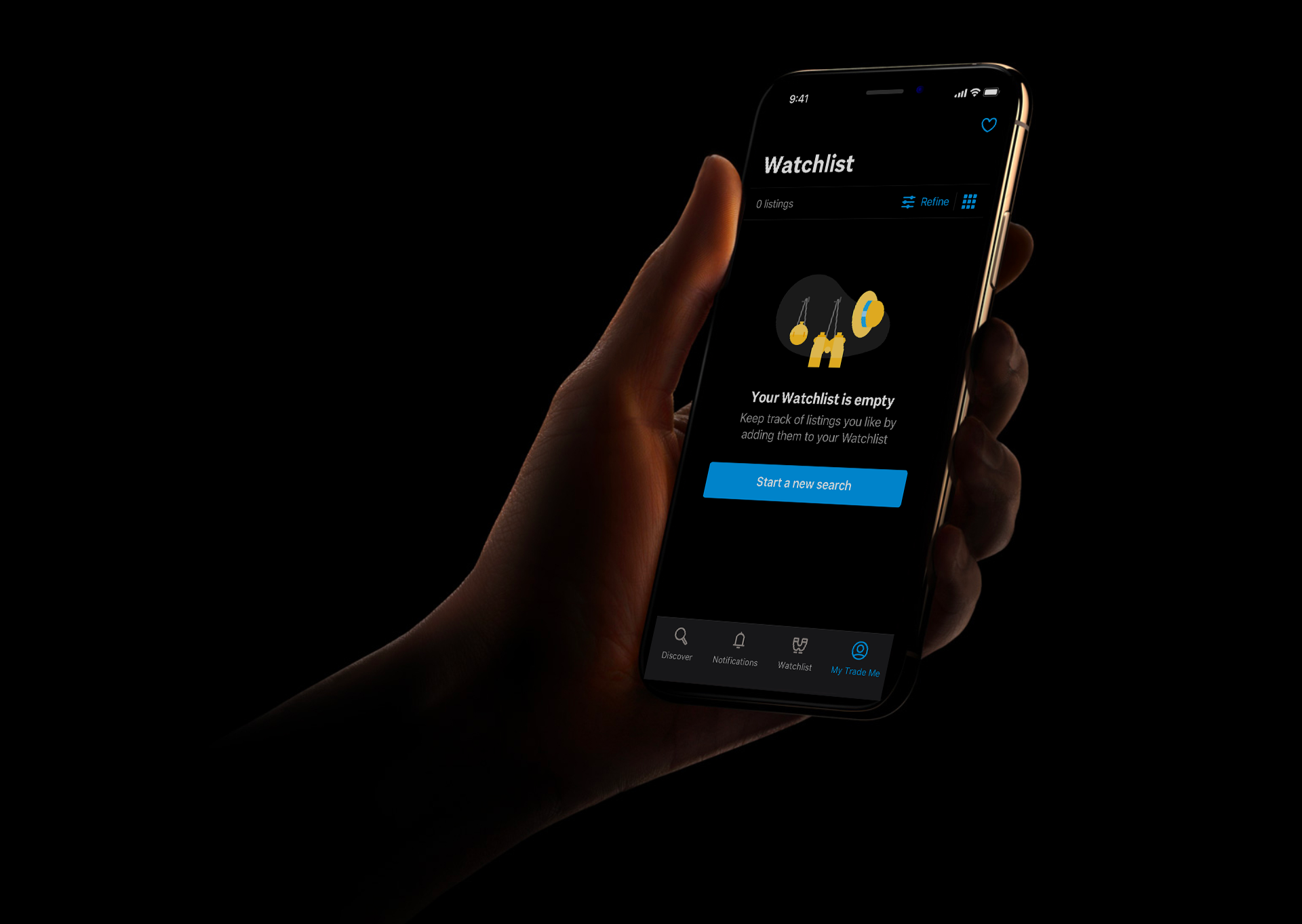
Our mobile design system allows us to build delightful, accessible apps that enable Kiwis to engage with Trade Me wherever they are, on whatever device they use.
You can read more about my process on creating a mobile design system, and learn tips for making your own in my medium article featured in UX collective.
Design at Trade me was distinctly split into mobile and web design, meaning designers and had little familiarity outside their area. With 40% of users accessing Trade Me on more than one device type, designers shifted their focus to work on features across multiple platforms.
The lack of a mobile design system in the past had caused the experiences on our iOS and Android apps to vary significantly. With the majority of our mobile designers being iOS users, they usually designed for iOS first and then when moving to Android, found the existing pages were so drastically different that a full redesign of their flows were required. This also resulted in developers creating bespoke solutions for each new feature, rather than reusing components. This was time consuming, and also meant there was little consistency in the design direction between projects.
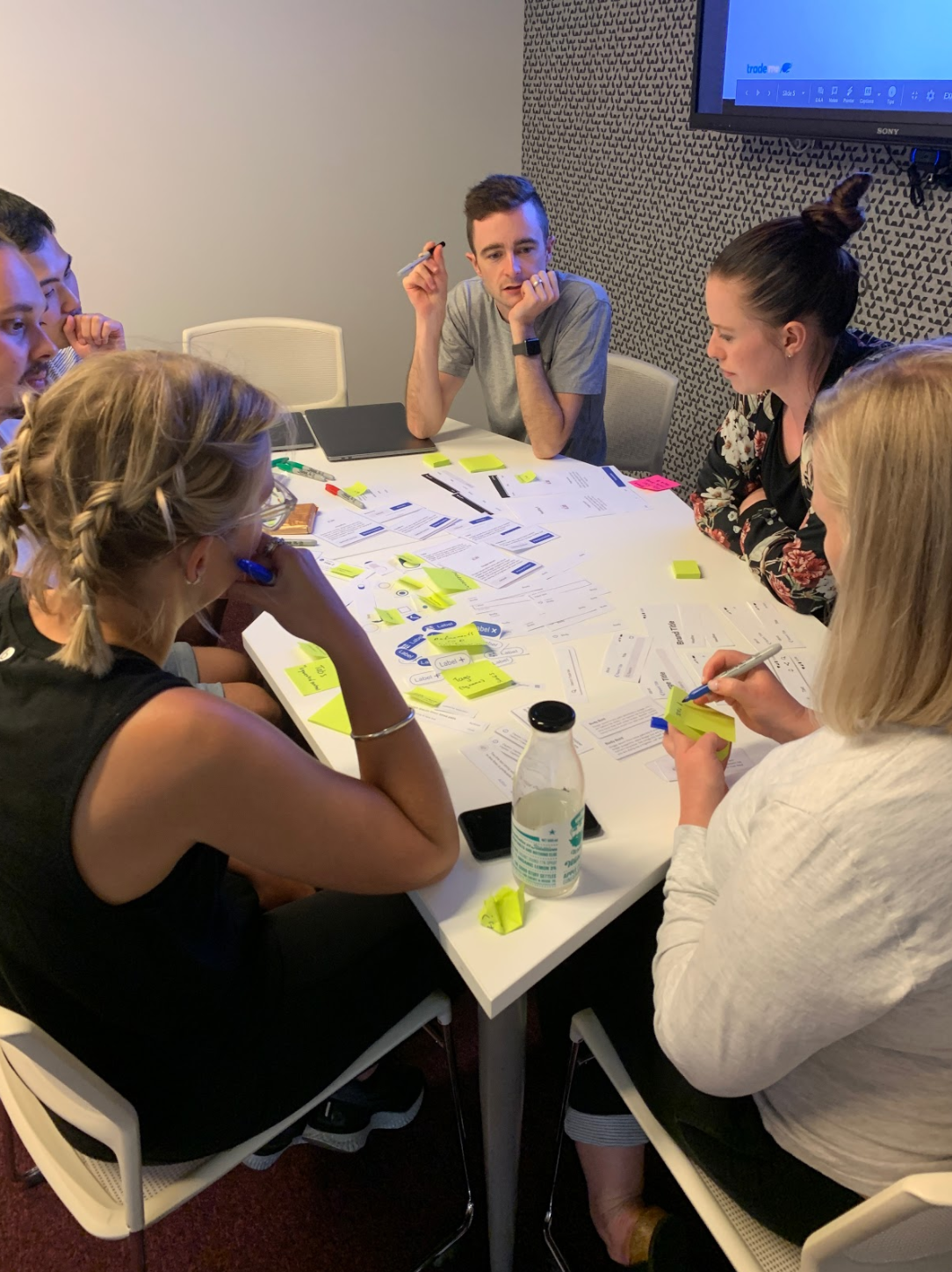
I ran workshops with designers and developers across the business, based on learnings from the invision design exchange conference. We looked at core flows across our existing product and vision work and determined the key patterns we were already using, and the design principles that underpinned them. We grouped and sorted these to understand each other's mental models and create a shared language so that designers and developers could easily communicate despite what programming or visual language they were familiar with. Involving the users of the system throughout the entire process helped create the system in a way that worked for everyone, and encouraged stakeholder buy-in.
Using UIkit and the Material Design System as building blocks, we stayed as native as possible while adding brand customisation to leverage trust and create consistency with our existing web design system.
In some instances, there were discrepancies between what components were available between iOS and Android, and in these cases we created custom components that behaved the same way across platforms, but were styled to feel consistent within their platform.
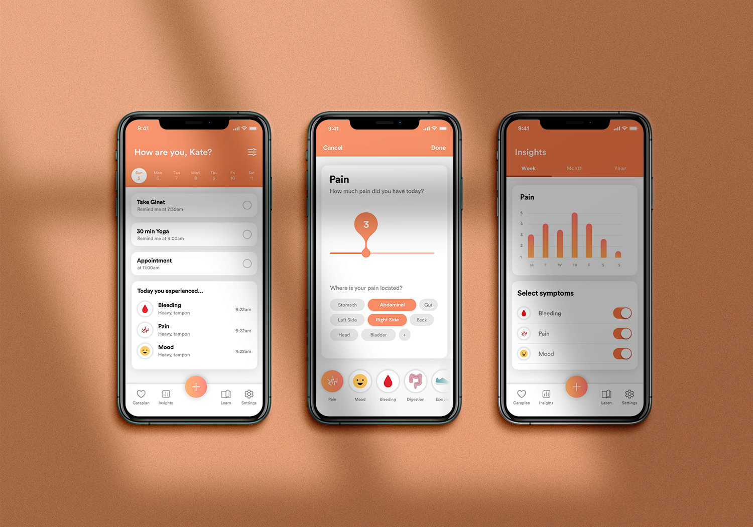
Dynamic type and dark mode are baked into every component within the design system. This saves time in testing, and allows us to respect our users’ preferred phone settings and fit seamlessly alongside our users’ other apps.
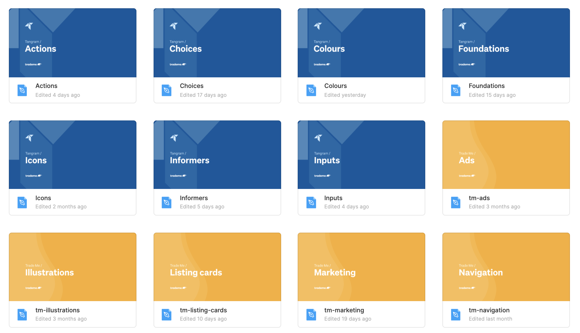
The mobile design system was originally created as sketch libraries, separate to the existing web ones, but with our company's migration to Figma, we looked to bring the design systems closer together. This made it even easier to work across all 3 platforms and revealed opportunities to further align the components.
Libraries were organised into user tasks to help our designers focus on solving user problems, rather than just creating screens. For example, if a designer was looking to inform the user of something within a flow, they would look in the “Inform” library, where they would find components such as info boxes, notifications, system alerts and pop-overs.
Keeping similar components closer together meant that even designers who weren’t currently working across all platforms could easily get familiar with the system as a whole and could visually identify which components corresponded with one another.