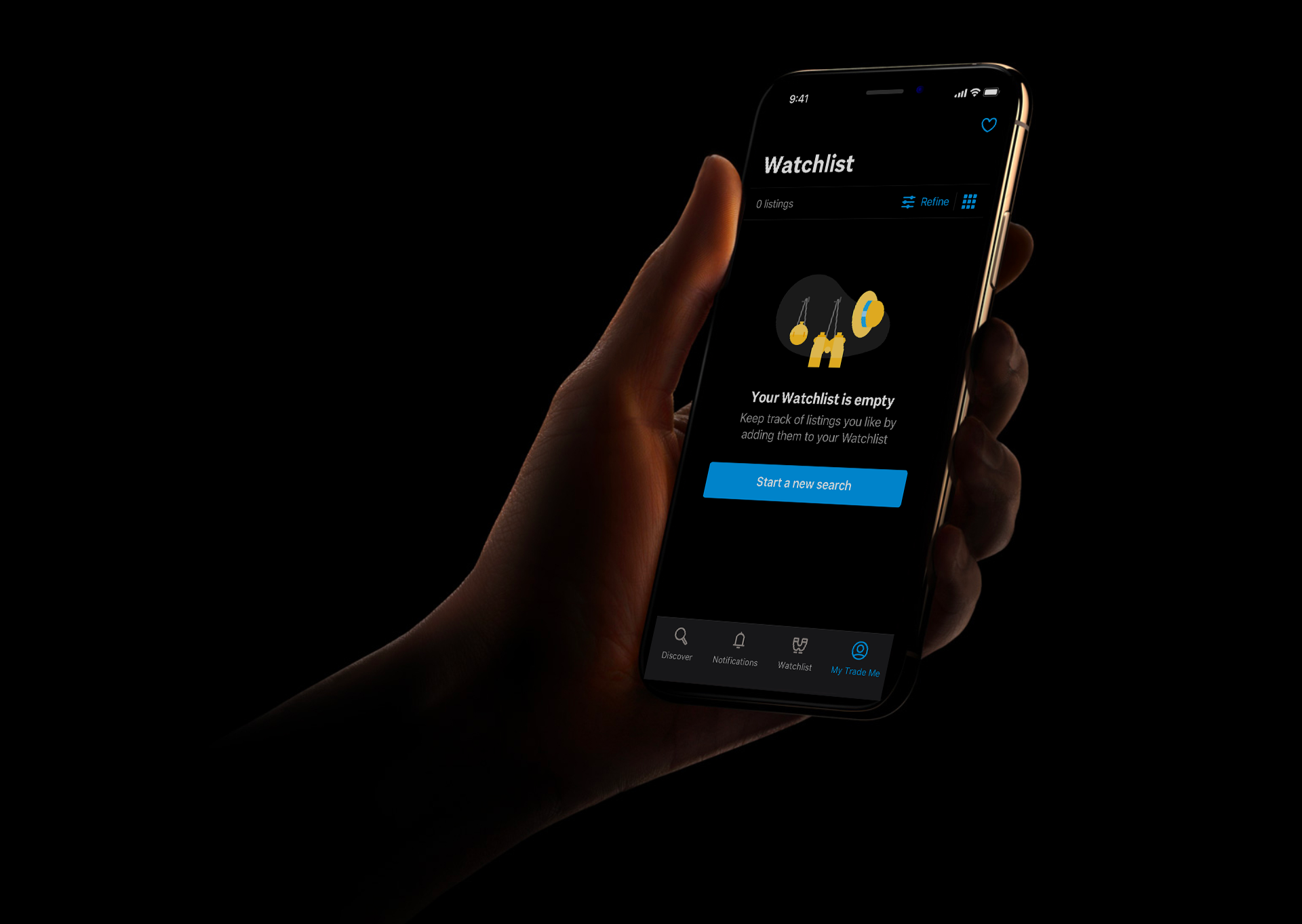
I worked with designers, developers and product managers across the company to help lead the creation of a dark theme for Trade Me's iOS and Android apps.
This was a heavily requested feature from users and has been adopted widely.
This project involved researching best practices and running workshops with designers and developers to share these learnings and apply the Trade Me brand to them.
I then went on to synthesise these workshops into design system components, colour pallets, illustration sets and guidelines for designers and developers to follow. I worked closely with developers and testers to implement dark theme across both platforms.
Dark mode improves visual ergonomics by reducing eye strain, adjusting brightness to current lighting conditions, and facilitating non-disruptive screen use in dark environments – all while conserving battery power. It also improves accessibility for people with visual impairments and migraines.
Careful consideration was taken to find the best balance between what was provided natively for dark mode, and where we should create our own bespoke elements. After exploration using our brand palette as a custom background, we decided to stick with the native backgrounds and elevations as it cut down significant dev time and allowed us a greater speed to customer value.
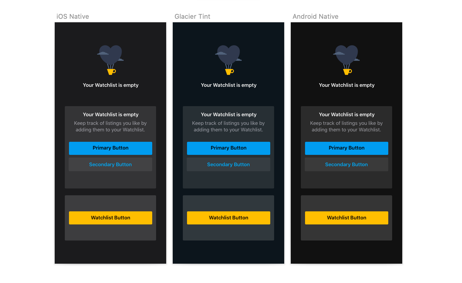
My research revealed that saturated colours which can look great on light surfaces, can visually vibrate against dark surfaces, making them harder to read. I used tones 2 shades lighter within our brand colour palette to create a desaturated pallette that encompassed the different subbrands in a way that reduced eyestrain without losing their familiarity to the user.
I used subtle accents on illustrations to give the feeling of "night time" this helped to further enhance the playful nature of Trade Me's illustration style.
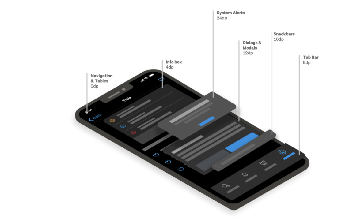
Elevation is core to hierarchy within dark mode as it enables different UI elements to standout to the user without the use of shadows. I decided to use system-defined semantics to future proof for any potential changes from Apple and avoid clashes in the instances where native components are used within the app such as system dialogs.
I decided to use opacity in the creation of UI components and text styles so that they passed accessibility standards and were visible to the user no matter which level of elevation they were displayed upon.